Starting point
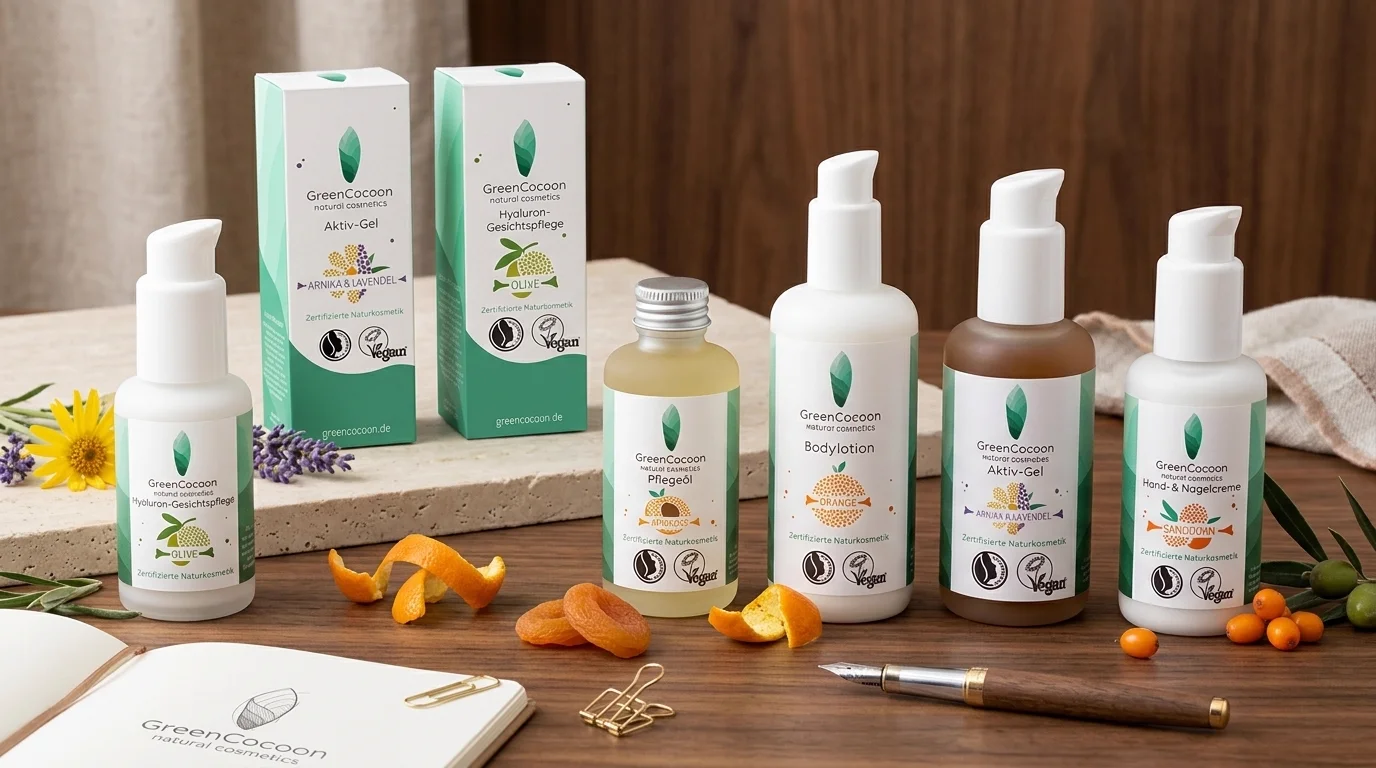
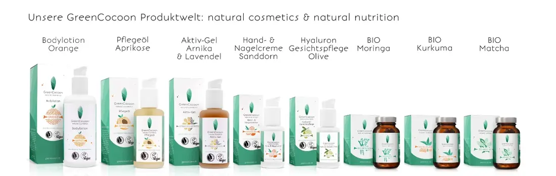
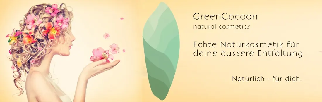
Natural cosmetics all look the same on marketplaces: beige, botanical, handwritten. Selling there is not a contest about quality, it is a contest for the first glance in a result list. On top of that came a second task: cosmetics and supplements had to read as one brand.
Do not get greener. Get clearer.
Execution



The decision
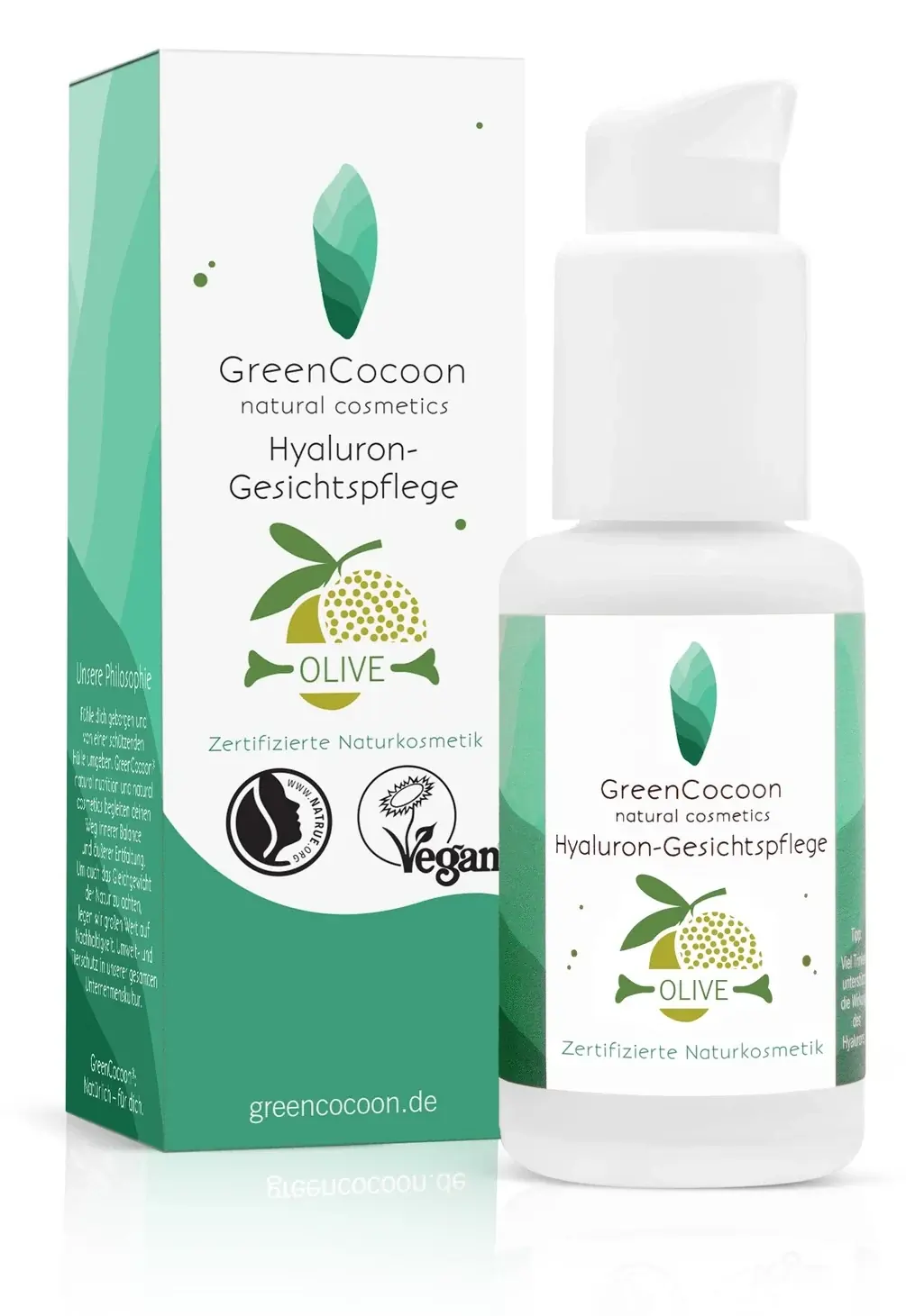
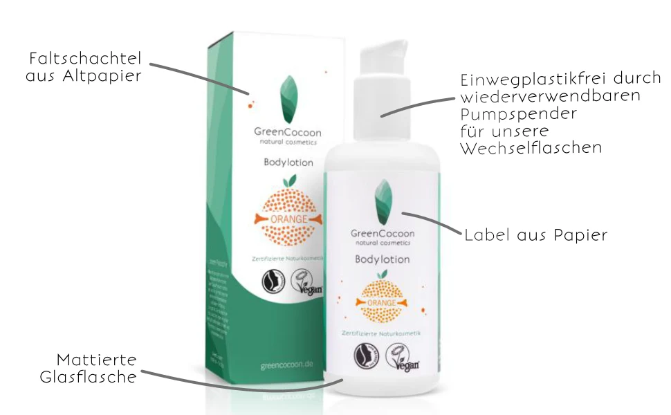
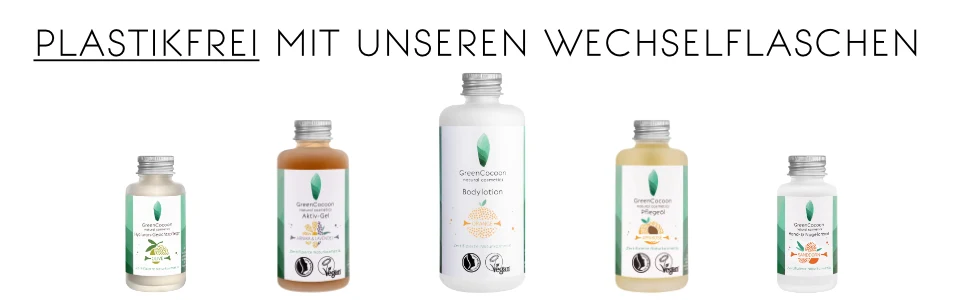
Visibility in the result list, not on the product page. The decision falls in the first half glance, long before any text, so the silhouette of the packaging carries the brand, not the label.
What we decided against
Against more green. Even more botany would have made the brand less visible, not more: it would have disappeared into the uniform look of the category.